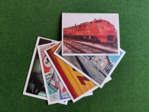
Vintage Railroad Postcards Westward Bound (Pack of 5)
$8.75
Go west, young man, and send back these retro railroading postcards. This pack takes you from the prairies of Nebraska to the sun-bleached streets of California. These cards use rare images from the collection of the author and designer, Ian Logan.
- RRP: £5.50 (incl. VAT)
- Format: 106 mm x 142 mm landscape
- Paper: 320 gsm Omnia Natural
- Weight: 31.25 g
- ISBN: 978 1 8733 2967 2
- Publication: October 2022
- Delivery
- UK: 75p
- International: £1.55
Ian Logan’s passion for vintage railroad graphics was rooted in a Fifties and Sixties childhood attuned to the sounds of folk, skiffle and blues. Hearing Lonnie Donegan’s hit ‘Rock Island Line’ on the radio in 1961 inspired Ian to pack up and go to America to see the names, the places and the trains for himself.
He has selected the images on these postcards from his collection of Kodachrome slides and printed ephemera, built up over a lifetime of journeys across America. You can now join him on a time traveller’s train ride to the sea and sun of the West Coast.
Union Pacific EMD SD40-2 Locomotive 3256, Nebraska, 1972
Gulf Mobile & Ohio GP38 Locomotive 717, Burlington Yards, 1972
St. Louis–San Francisco SD45 Locomotive 926, Burlington Yards, Kansas City, 1972
Western Pacific Feather Logo on Boxcar, St Louis, 1972
Los Angeles Union Station, California, 1980s

Ian Logan was at the centre of the design revolution that marked the end of post-war austerity. He studied at the Central School of Art and Design in London (now Central St. Martin’s), and won a scholarship to the Konstfack, Stockholm’s University of Arts, Crafts and Design. In the early 1960s he joined JRM Design, a fabric print company set up by a group of Central graduates in an almost derelict building in London’s East End. Ian and his partners produced prints for up-and-coming fashion designers such as Mary Quant and Jeff Banks, and designed a tin tray with a Middle Eastern-inspired motif that became enormously successful, first in Carnaby Street and then all over the UK.
Mad on Americana
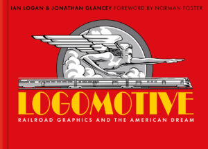
In the mid-1970s he set off in a new direction. Inspired by decorative Victorian tin boxes, he produced a range of tins for Harrods, Fortnum & Mason, Whittard of Chelsea and the National Trust. Commissions came from France, the Netherlands and the United States, for which he developed the Americana range featuring diners, gasoline stations and collectable cars. His obsession with Americana has inspired a book, too. Logomotive is a visual tribute to the design and marketing of mid-century American railroads, full to bursting with pictures and ephemera from Ian’s collection.
You may also like …
-

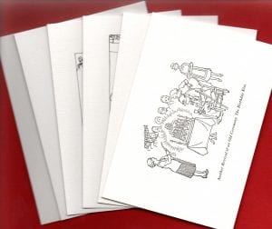
Heath Robinson Greetings Cards (Pack of 6)
$19.95 -

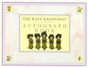
The Kate Greenaway Autograph Book
$15.95 -

Vintage Railroad Postcards Streamline Style (Pack of 5)
$8.75 -

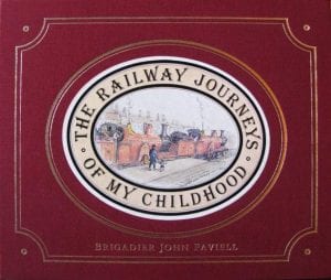
The Railway Journeys of my Childhood
$25.00 -

Logomotive
$55.00 -

The Power of Steam
$40.00 -

The Railways of Britain
$40.00 -

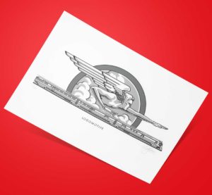
Logomotive Limited Edition Print
$24.95 -

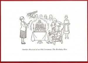
Heath Robinson Birthday Card
$3.95 -

Heath Robinson Christmas Cards (Pack of 6)
$10.95 -

Heath Robinson Valentine Card
$3.95 -

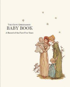
The Kate Greenaway Baby Book
$24.95