Journalist on the Footplate
How many journalists get to drive a Coronation class steam locomotive? Our intrepid author Jonathan Glancey did. In a podcast published today he also tells what it was like riding the footplate of Duchess of Hamilton from Settle to Carlisle and what he loves about the marriage of art and engineering.

Sam, the podcast interviewer, is a popular presenter of live streams hosted on Railfan TV by Train Simulator, a train-driving video game. Today he is talking to Jonathan Glancey for We Are Railfans, an associated group with wide interests and an international following. ‘What’s it like being a journalist on the footplate?’ he asks Jonathan.
Jonathan warms to the subject. ‘Climbing up those hills was like being inside a mobile thunderstorm,’ he says, ‘the fire blazing, the safety valves hissing, the engine pounding, the wheels gliding along.’
It’s one thing to be allowed on the footplate, another to take the driver’s seat and yet another to have the gift of the gab. Jonathan Glancey combines engineering, history and writing flair to carry you away on a magic carpet of steam, landscape and romance. To hear him describe how his childhood dreams have come true, follow this link.

Not any old trainspotter
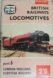
Jonathan Glancey had an Ian Allan trainspotter’s guide, but he never took down numbers. His interests were the art and design. From childhood, he loved going into the great railway stations where you could see engineering and architecture with magnificent machines inside, ‘an aesthetic engineering package’.

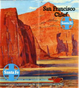
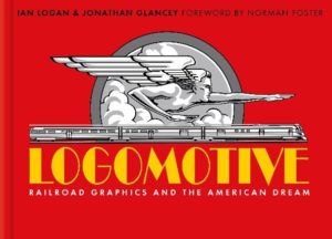
His latest book Logomotive is about how American railroads look, he explains, about the epic scale of the landscape and the history of the last 50 to 100 years. So many railroads survived into the 20th century as independent companies, each with its own look and emblems, and it was captivating to go through the pictures taken by his co-author Ian Logan, to see the sheer variety and kaleidoscope of images. He evokes the glamour of travelling from Kansas City to San Francisco on a great passenger express like The Chief, crossing the wheat plains of the Midwest, climbing the mountains, racing across the desert at 85–100 m.p.h. in a cocktail bar, a diesel engine at the front.
Romantics at heart
We Are Railfans have an almost poetic video on their home page in which they celebrate the experience of rail travel and look at the world outside, ‘a face at the window, a broken bike in the yard, fields, rivers wide, in and out of cities, towns and countryside where time is our own.’ They like everything about trains, ‘a festival of deafening noise, heat, pistons and smoke, steam, ground-shuddering power and thrilling high speeds.’ These are not nerds. These are a more discerning bunch. They aim to get under the skin, delve down into the ‘unappreciated backbone of a nation’, enjoy the pleasure of the journey and study how it all works.

Jonathan Glancey enjoys the experience of travelling in a mobile weather system and imbibing all the stuff you get in a spotter’s guide: tractive effort, weight, cylinder dimensions, name of designer. It’s like learning nursery rhymes. It stays with you, he says, but the older you are the more you get into it, so you learn that Stanier was primarily a production engineer rather than a designer, and that others under him shaped locomotives in his name. Ian Allan may have started him off, but Glancey’s interest snowballed. He found architecture fascinating, engineering riveting (sorry for the pun) and railway operations ‘like seeing a trainset working in front of my eyes’.
Put Glancey and We Are Railfans together and the sparks fly, the smoke belches, the tracks shudder.
Get the story
To listen to the podcast, click here.
For the best of contemporary railway writing, see Logomotive: Railroad Graphics and the American Dream by Ian Logan and Jonathan Glancey. It has a rousing Foreword by that other passionate follower of railway design, the architect Norman Foster.

An authoritative overview of the high tide of railroad design, written by professionals who really know their business. – Kevin Keefe, Railroad Heritage Magazine.
More articles…
The Enthusiasm of Jonathan Glancey ⋅ The Secret Romance of Ian Logan ⋅ Design Interests of Norman Foster ⋅ Inside the Cab of Big Boy 4014